
Behind the Print
Why Screens and Paper Differ (And How We Match Them Perfectly)
5/17/20262 min read
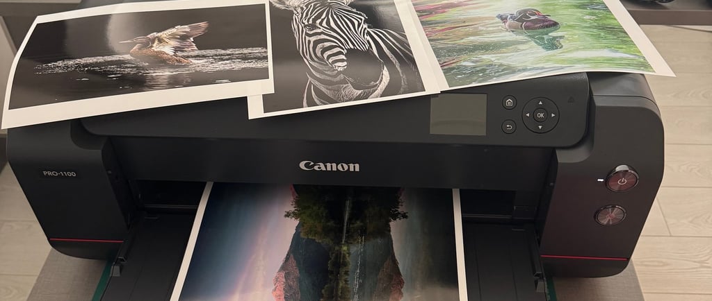
Have you ever ordered a beautiful art print online, only to find it looks a tiny bit different when you hold it in your hands? Perhaps the colors feel a bit softer, or the shadows look a little deeper than they did on your phone or laptop.
If this has happened to you, don’t worry—your eyes aren’t playing tricks on you, and it’s certainly not a defect. It’s actually a beautiful quirk of physics!
Today, we’re taking you behind the scenes to explain why screens and paper see the world differently, and the meticulous Lightroom touch-ups we perform on every single file to ensure your physical print looks as breathtaking as possible.
The fundamental difference between a digital image and a physical print comes down to one thing: light.
Your Screen (Emissive Light): Monitors, smartphones, and tablets are essentially glowing lightboxes. They project light through pixels directly into your eyes using a digital backlight. This makes colors look incredibly vibrant and gives shadows an artificial boost in brightness.
The Paper (Reflective Light): Physical paper has no backlight. It doesn’t emit its own light; instead, it relies on the ambient light in your room to bounce off the ink and reflect into your eyes.
Because paper lacks that digital glow, a raw digital file printed directly onto paper will often look darker and less vibrant than it did on a screen.
The Great Debate: Backlight vs. Ambient Light
How We Bridge the Gap: The Lightroom Touch-Up
We don't just hit "print" and hope for the best. To counteract these natural technological differences, every image goes through a dedicated proofing and touch-up process in Adobe Lightroom before it ever touches the printer.
Here is exactly what we do to ensure maximum likeness and premium quality:
1. Exposure and Shadow Compensation
Because paper naturally absorbs light rather than emitting it, shadows can sometimes "muddy" or lose detail in print. In Lightroom, we carefully lift the shadows and slightly boost the overall exposure of the file. This ensures that the hidden details in the darker areas of the artwork remain crisp and visible on paper.
2. White Balance & Tone Adjustments
Screens naturally lean toward a cool, blue-ish tint. Paper, depending on the premium texture we use, inherently has a warmer, more organic tone. We tweak the white balance in Lightroom to ensure that skin tones, skies, and neutral backgrounds translate beautifully from the cold digital environment to the warm physical world.
3. Soft Proofing for Color Accuracy
Using advanced "Soft Proofing" profiles in Lightroom, we simulate how specific inks will react with our exact paper types on screen. If a certain vibrant green or deep magenta falls outside of what a printer can physically achieve, we meticulously recalibrate the color channels by hand. This brings the colors back into perfect balance without losing the artwork's original mood.
The Result: A Masterpiece Built for Your Walls
Our goal isn't just to copy an image from a screen; it's to translate it into a tangible piece of art.
While a tiny variation between your glowing monitor and the final print is a natural part of the printing process, our dedicated Lightroom adjustments bridge that gap. When you frame your print and hang it on your wall, you aren't just looking at a replica of a digital file—you are looking at an optimized, professionally crafted piece designed to shine in the natural light of your home.